
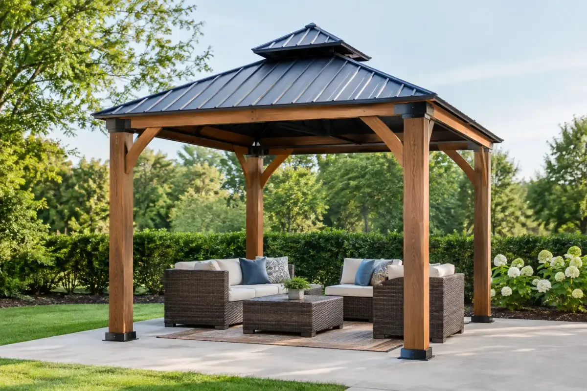
A branded gazebo gets noticed long before anyone reads a brochure. But strong results do not come from dropping a logo onto a roof template and hoping for the best. Clear gazebo artwork specifications make the difference between a professional, high-impact event setup and a costly print that is hard to read, poorly positioned or inconsistent with your brand.
For markets, race days, council programs, trade displays and sporting events, the gazebo is both shelter and signage. Its artwork needs to work from across a car park, beside a busy footpath and at eye level when customers step under the canopy. That means designing for the structure, the print process and the real conditions your team faces outdoors.
Start With the Gazebo Size and Print Area
Artwork should always be built around the exact gazebo model and size. A 3 x 3 m pop-up gazebo does not have the same roof-panel proportions as a 3 x 4.5 m or 3 x 6 m structure, and side walls introduce another set of print areas, seams, zips and visibility considerations.
Do not design from a generic rectangle. Request the correct production template first, then place artwork within its marked print zones. The template accounts for the roof valance, peak, panel joins, hems and areas that wrap around the frame. It also shows where logos may sit differently once the roof is tensioned into position.
The valance is usually the highest-value branding position. It is visible from all four sides and can carry a business name, logo, campaign line or website address. The roof itself is ideal for larger graphics, repeated logos, colour blocks and branding intended to be seen from upper levels or across open event spaces.
Side walls can do much more than close off wind or rain. A full printed wall creates a large, uninterrupted advertising surface. Half walls can keep the front open for customer interaction while defining the space. For teams that attend varied events, a mix of branded walls, plain walls and optional door walls gives greater flexibility than a fixed, all-over print approach.
Design for Distance, Not Just the Screen
The most common artwork mistake is making key information too small. A design can look sharp on a laptop, then disappear once it is printed across a three-metre roof edge and viewed from 15 metres away.
Start with the question: what should people recognise first? For most organisations, it is the logo or business name. For a specific activation, it may be the event name, team identity or a simple offer. Give that message room to breathe. A crowded valance with five service lines, phone numbers, social icons and a tiny logo may technically include everything, but it will not communicate quickly.
Use large, high-contrast elements. Dark lettering on a pale background, or pale lettering on a dark background, generally performs best. Fine type, low-contrast colour combinations and busy photographic backgrounds need careful handling because outdoor light can flatten detail. Sun glare, rain, dust and a fast-moving crowd are all working against small design features.
A useful rule is to keep one primary message per visible panel. Your front valance might carry the brand name, while each side valance carries a short service category, campaign phrase or location message. The artwork stays clean, and people can understand it from different approach angles.
Choose Artwork That Suits Fabric Printing
Custom printed gazebos are commonly produced with dye-sublimation printing, where ink is transferred into the fabric rather than sitting heavily on top of it. This delivers strong colour penetration and a professional finish suited to repeated outdoor use. It also means artwork needs to be prepared properly before production.
Vector logos are the best starting point. AI, EPS, SVG and print-ready PDF files retain clean edges when enlarged. A low-resolution JPEG pulled from an email signature or social profile may look acceptable on screen but can become soft, pixelated or blurry when printed at gazebo scale.
Photographic elements can work well, particularly for food brands, tourism campaigns and product-led activations. They must be supplied at sufficient resolution at final print size. If the image is not sharp enough, enlarging it in design software will not create missing detail. Use a high-quality original image or choose a bolder graphic treatment instead.
Colours also need realistic expectations. Screen colours are made from light, while printed fabric uses ink. A bright fluorescent shade, metallic finish or ultra-dark black may reproduce differently on polyester fabric than it does on a calibrated monitor. Supply brand colour values where available, preferably CMYK or Pantone references, and assess the digital mock-up before approving production.
Safe Zones, Seams and Roof Geometry Matter
Gazebo roofs are not flat billboards. They are shaped panels pulled over a peak and supported by framework. Each panel may include seams, reinforcement points, hems and joins, depending on the structure and roof design.
Keep critical words, logos, faces and fine lines away from panel edges and seam locations. A logo that straddles a seam can lose impact, while small text near a hem may become hard to read once the material is folded and stitched. Background colours and non-essential patterns can extend into bleed areas, but important artwork belongs inside the safe zone marked on the template.
The roof peak deserves special attention. A central logo may look balanced in a flat file, yet become distorted by the rise of the canopy or split across roof panels. In many cases, repeated logos positioned within each roof panel produce a cleaner result than forcing one large graphic across the peak.
If you are using a roof with contrasting valance and canopy colours, check how the transition supports the brand. A dark roof with a bright valance can make the business name highly readable. A full-colour roof can create maximum visual impact but may need a simpler logo treatment to avoid visual noise.
Build a Practical Artwork Plan for Every Event
A gazebo is reusable infrastructure, so artwork should suit more than one Saturday. Before approving a design, think about where it will operate over the next two to five years. A permanent phone number, logo and broad service message will usually outlast a short-term promotion.
For organisations running multiple campaigns, keep the roof branding evergreen and use interchangeable walls, banners, flags or table covers for campaign-specific messaging. This protects the value of the printed gazebo while allowing your team to refresh the site presentation for different events.
Consider sightlines as well. If visitors mostly approach from the front, invest in a powerful front valance and back wall. If the gazebo sits in the middle of an oval, expo aisle or market lane, all four sides need to carry the brand. Food vendors may benefit from a serving-window wall, while sporting clubs may prefer open sides for quick access to gear, registrations or first-aid supplies.
Artwork cannot compensate for an under-specified frame or poor anchoring. A large graphic roof catches attention, but it also operates in the same wind and weather as the rest of the structure. Match the print package to a commercial-grade gazebo, appropriate weights, pegs and tie-down equipment for the surface and conditions. Never treat a wind rating as permission to leave a gazebo unsecured.
What to Supply for a Faster Approval Process
A complete artwork brief reduces revisions and keeps production moving. Along with your logo files, provide your preferred colours, wording, contact details and any must-use imagery. Identify which panels need printing and whether the design should be identical on every side or vary by location.
For a clean handover, supply:
- vector logo files where available, plus high-resolution images for photographic artwork;
- brand colour references and preferred fonts;
- exact copy, checked for spelling, mobile numbers and web addresses;
- a note on intended gazebo size, roof printing and wall configuration; and
- examples of previous branding or a simple visual direction if your team needs design support.
A free visual mock-up is the point to check the details that matter: logo scale, reading direction, panel placement, colour balance and whether the setup looks strong from the customer-facing side. Do not rush approval because the wording is correct. Look at the whole structure as it will appear at an event.
Gazebo Artwork Specifications Should Work Hard
The best designs are not necessarily the busiest or the most complicated. They are recognisable at a distance, readable in harsh light and built around the actual geometry of the gazebo. They also leave room for your team to use the shelter properly, whether that means serving customers, registering competitors, displaying stock or protecting equipment.
Mountain Shade can help turn a logo and a rough idea into a print-ready gazebo package with the right roof, wall and frame configuration. Bring clear brand assets, choose the visibility you need, and approve artwork only when it looks ready to perform outdoors.
